Web Widget Overlay
This feature allows you to display web content—such as websites, local HTML files, or entire web projects contained within a ZIP file—as an overlay on your screen. You can configure it to be a full-screen interactive browser, a floating window, or a non-interactive informational widget.
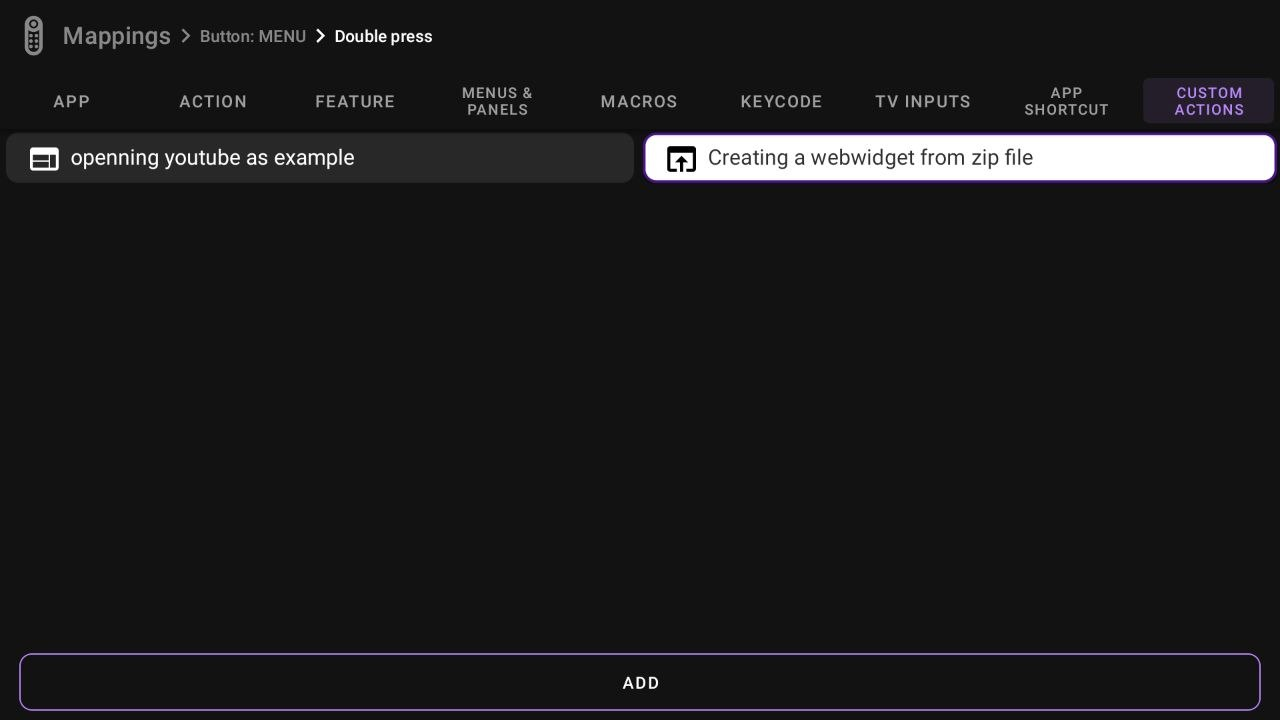
Creating a Web Widget Action
-
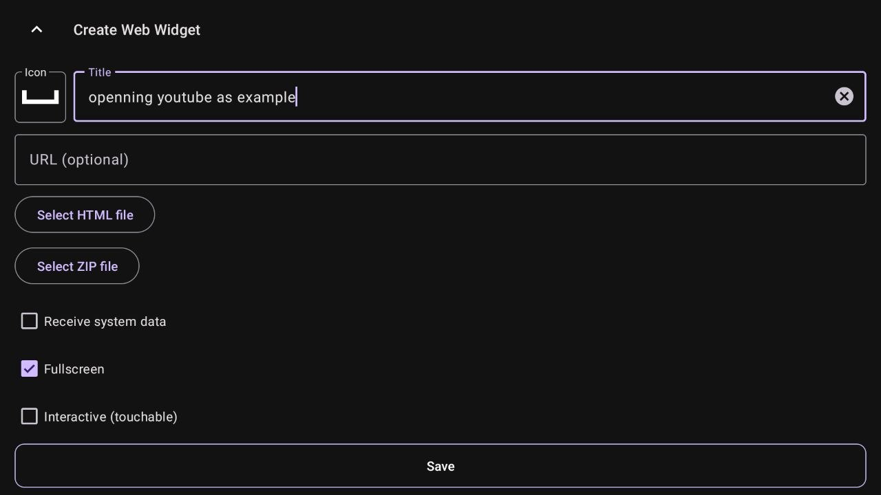
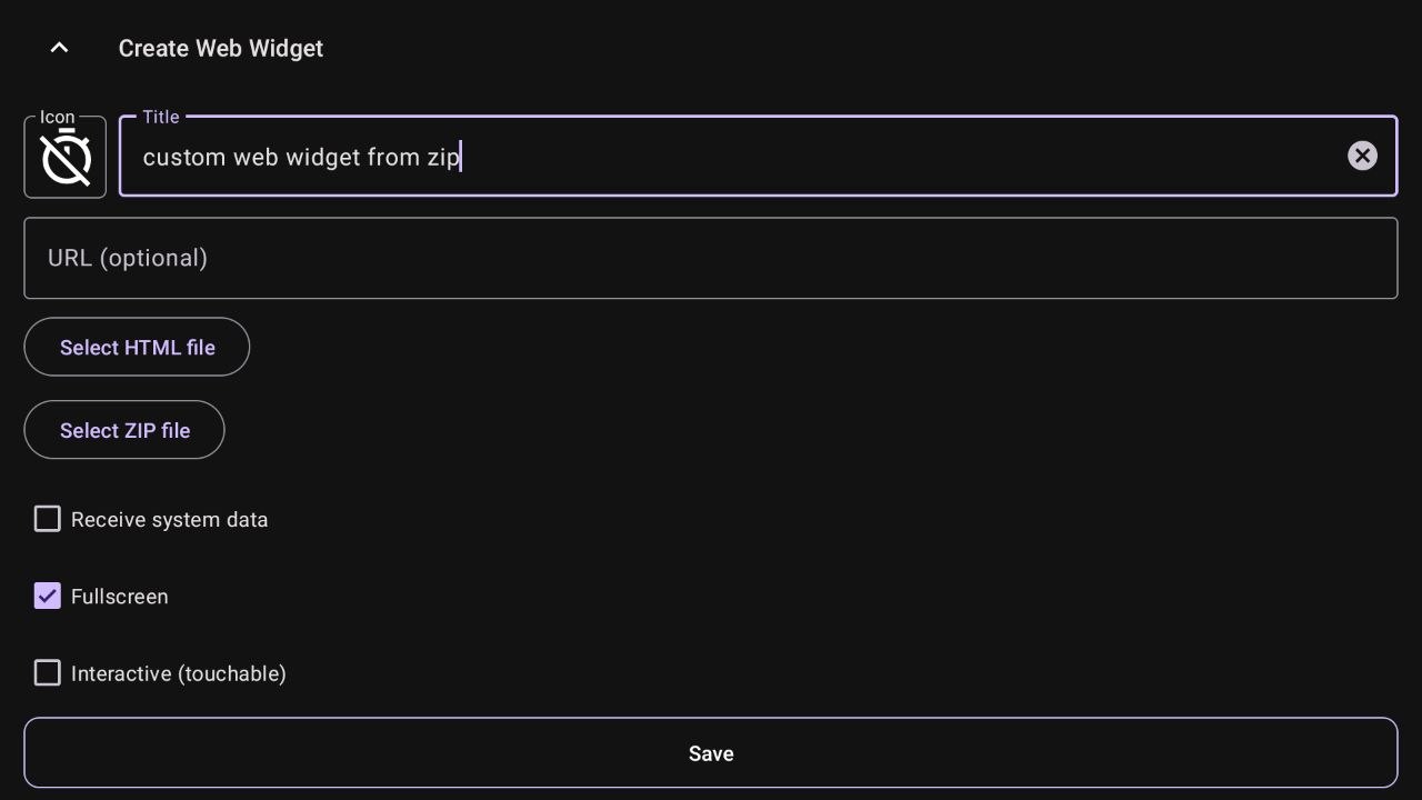
Start the configuration. Give your action a custom title. This is how it will appear in your mappings.
-
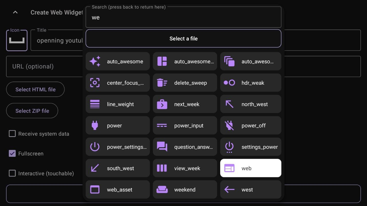
Choose an icon. Click the icon box to select a visual style for your widget from the available dialog.
-
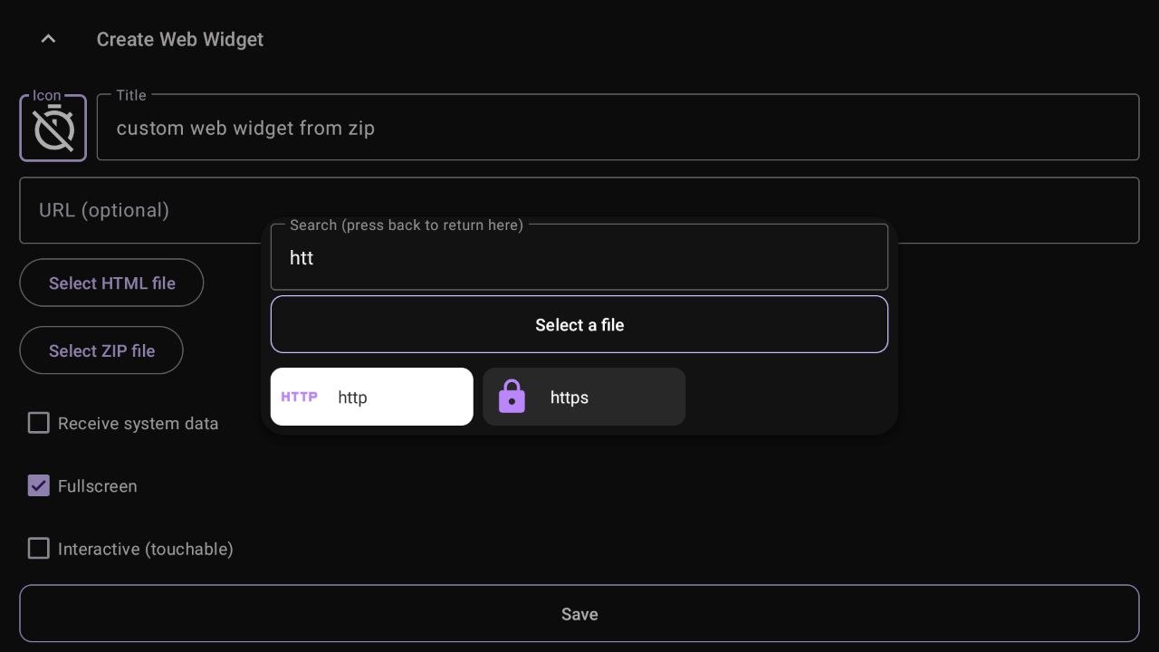
Enter the URL or Select a File.
- URL: Type the web address (e.g.,
www.youtube.com). - Local Files: Use "Select HTML file" or "Select ZIP file" for local projects.
Important
ZIP projects must contain an
index.htmlfile at the root level to load correctly. The app automatically strips a single top-level folder if all files are inside it (e.g.,my-widget/index.htmlworks fine).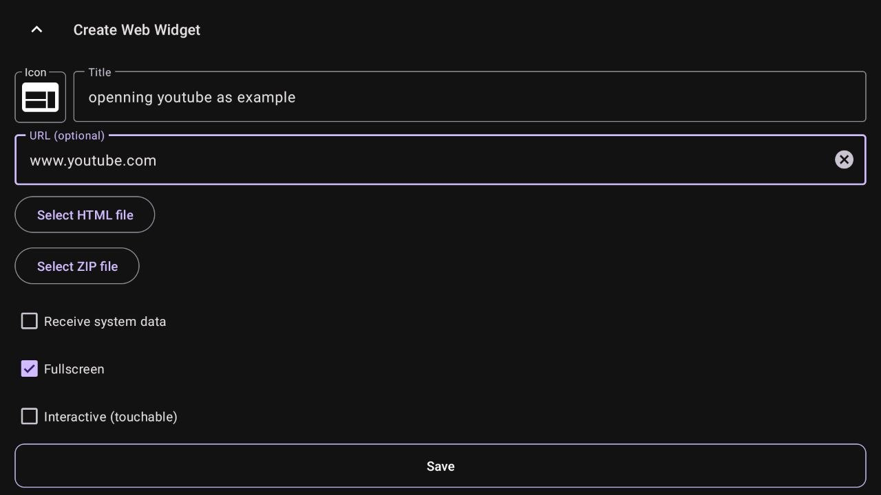
- URL: Type the web address (e.g.,
-
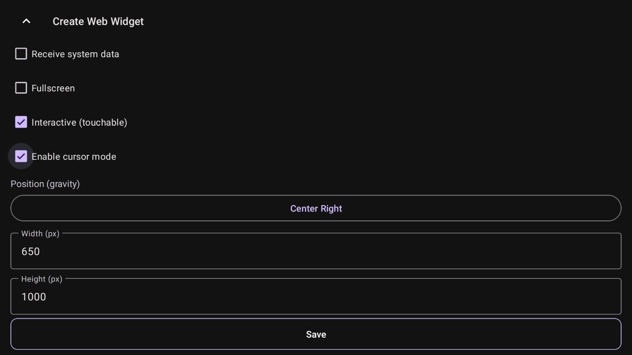
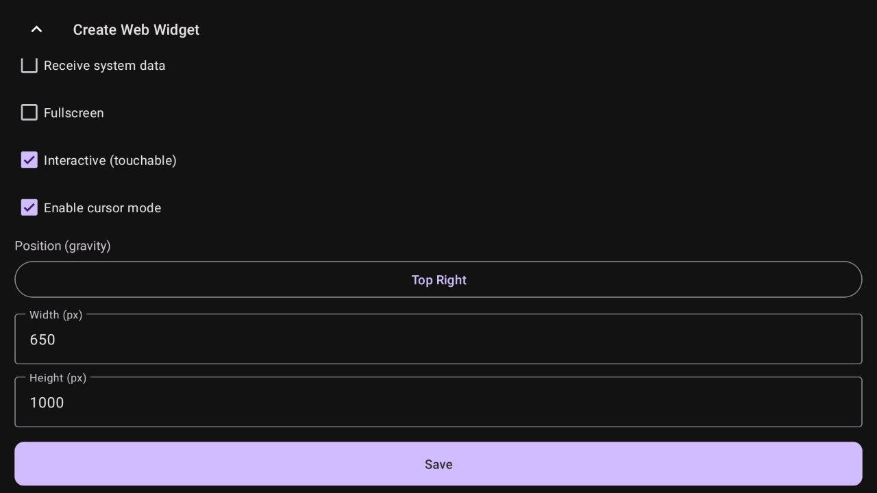
Configure Display and Interaction. Adjust the following behavioral switches:
- Receive system data: When enabled, the app injects live device telemetry (CPU, RAM, network, media info, IP addresses, etc.) directly into your widget via
window.onFieldChangecallbacks. Only useful if your widget has those callbacks implemented. See Building a system data widget below. - Fullscreen: If disabled, you can set custom window dimensions.
- Interactive (touchable): When enabled, the overlay takes focus. When disabled, the window is "transparent" to input, allowing you to control the background app.
- Enable cursor mode: (Only if Interactive is on) Displays a virtual mouse cursor. If off, you navigate using standard DPAD directional keys.
- Receive system data: When enabled, the app injects live device telemetry (CPU, RAM, network, media info, IP addresses, etc.) directly into your widget via
-
Set Position (Gravity). Choose where the widget will appear on the screen. Available positions:
Center,Top Center,Bottom Center,Center Left,Center Right,Top Left,Top Right,Bottom Left,Bottom Right.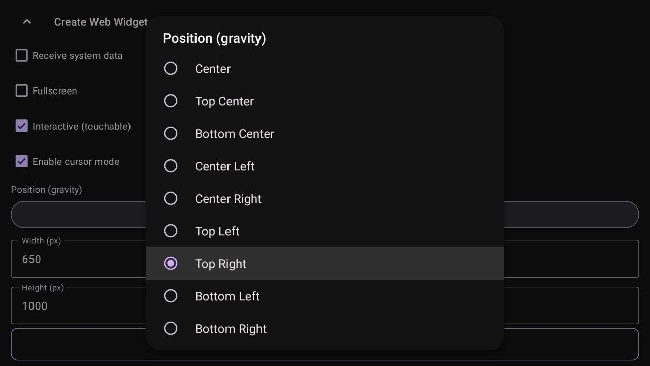
-
Define Size. Enter the specific Width and Height in pixels for your overlay window.
-
Save the Action. Click "Save" to finalize. The action is now ready to be used in your mappings, menus, or macros.
Examples in Action
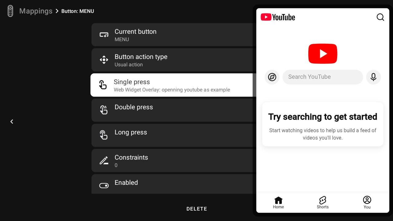
YouTube Web Overlay In this example, YouTube opens as a side window. Since Interactive and Cursor Mode are enabled, you can use the virtual pointer to navigate the site while keeping your background app visible.
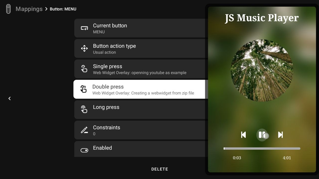
Local JS Media Player (from ZIP) This shows a media player loaded from a local ZIP file. It is configured to be Interactive, allowing you to control the JS interface directly with your remote.
Setting Up a Ready-Made Widget from a ZIP
If you already have a downloaded widget package (like the All-in-One Overlay Pack shown in the community), here is the step-by-step process to initialize and map it:
-
Create the Action: Give your widget a custom title (e.g., "custom web widget from zip") and choose an appropriate icon.
-
Load the widget file: Press Select ZIP file and choose your widget package from device storage, or select a single self-contained HTML file if your widget does not require extra assets or a
config.jsonfile. Note: Live callbacks such aswindow.onFieldChangestill work in standalone HTML files, but the Configure Widget button is only available when using a ZIP package withconfig.json. If your widget is a simple static HTML design, you can leave Receive system data unchecked. However, if it relies on live device metrics, make sure it is enabled.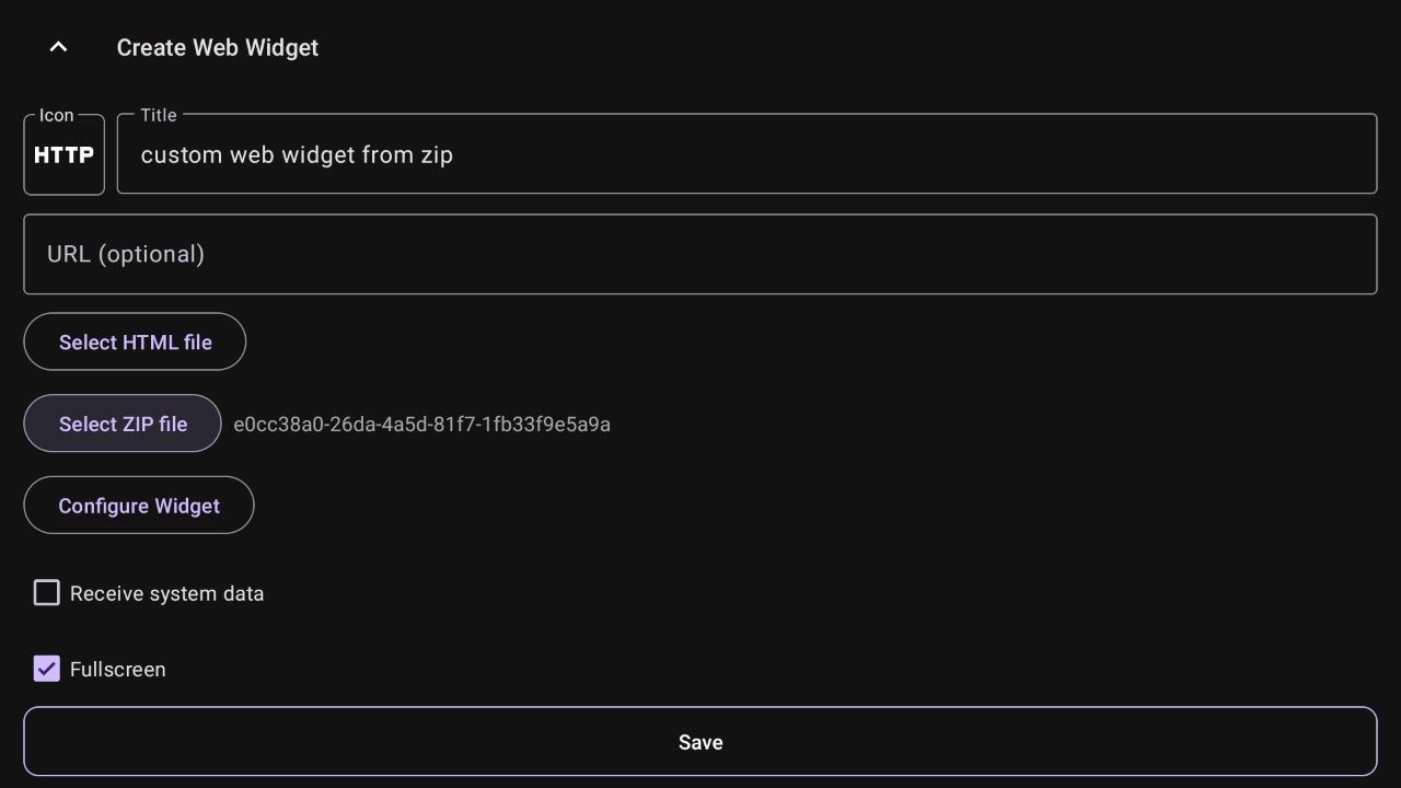
-
Configure Settings (Optional): The Configure Widget button will only appear if the ZIP contains an internal
config.jsonfile. This allows you to customize settings without editing code.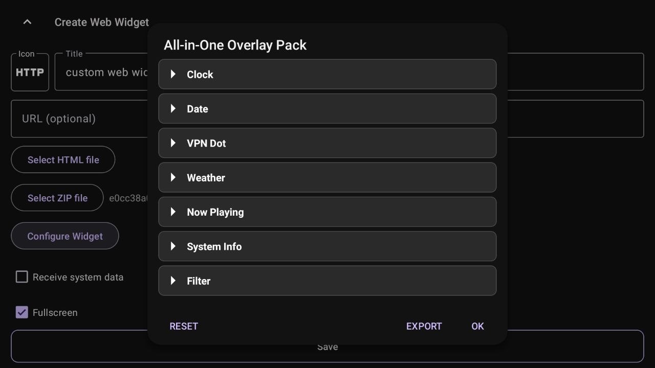
-
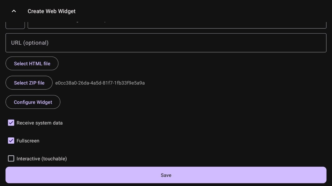
Configure Display Options: From the four available options shown, the most relevant one is Receive system data, which should only be enabled if your widget is intended to display live device telemetry such as CPU, RAM, or network usage. See Building a system data widget below. The remaining display and interaction options, like Fullscreen, Interactive (touchable), and Enable cursor mode, can then be adjusted based on how you want the widget to behave before saving.
-
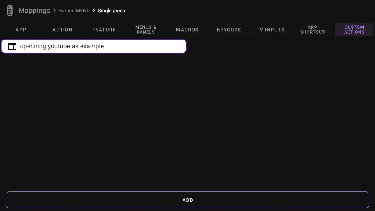
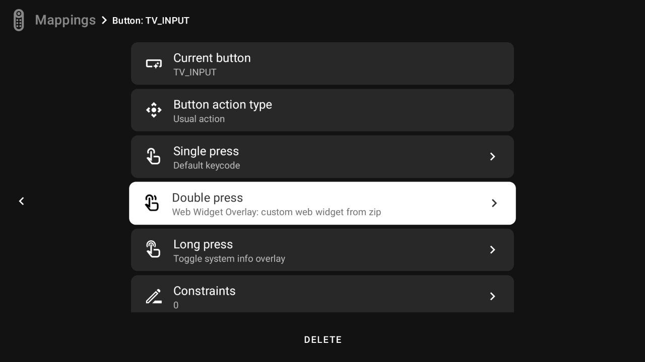
Map to a Remote Button: Navigate to the Mappings tab in tvQuickActions. Select a button and assign your new "Web Widget Overlay" action to a specific trigger.
-
Enjoy your Overlay: Press the mapped button on your remote. The widget will appear exactly as configured, overlaying your current app or background!
Building a system data widget
Pro-Tip: Use AI to build your own custom widgets!
The technical sections below explain how this system works under the hood. While it involves HTML/JS, you don't actually need to be a programmer! Simply copy the documentation from here until the end of the page, paste it into an AI (like Gemini, ChatGPT or Claude), and tell it: "Using this documentation as context, write the HTML, CSS, and JS for a tvQuickActions widget that displays [your idea here].". It will generate the files for you!
Credit: Special thanks to @Thorfinn66 on Telegram, who designed the integration logic based on
config.jsonand the method to inject data directly into the widget. If you need help or want to share widgets, join the community at t.me/tvquickactions.
Overview
When Receive system data is enabled, the app automatically injects dispatcher.js into your page's <head> before any other script runs. This script exposes a global window.onFieldChange dispatcher object. Your widget registers callbacks on it; the app then calls those callbacks whenever live data changes (roughly once per second for sys_* fields). The final design, the layout, and which specific data points you choose to display are entirely up to you.
ZIP file structure
Any widget ZIP must contain at minimum an index.html and, if you want the Configure Widget dialog, a config.json. Everything else is optional.
my-overlay.zip
├── index.html          ← required; entry point loaded by the app
├── config.json         ← required for the Configure Widget dialog
├── style.css           ← optional
├── script.js           ← optional
├── scripts/
│   └── my-widget.js    ← optional; recommended pattern for multi-widget ZIPs
├── fonts/
│   └── myfont.ttf      ← optional; reference via relative path in CSS
└── assets/
    └── logo.png        ← optional
ZIP root stripping
The app automatically strips one top-level folder from the ZIP if all files live inside it. So both index.html at the zip root and my-widget/index.html inside a single folder work correctly.
Exporting your widget
Once you've configured a ZIP widget, you can export it back as a ZIP (with any configuration changes saved inside config.json) using the Export button in the Configure Widget screen. The exported file is saved to your Downloads folder.
How live data is delivered
The app injects dispatcher.js into your <head> automatically. This script exposes window.onFieldChange — a global dispatcher object. You register callback functions on it, keyed by field name. They are called automatically whenever a value changes.
Two registration patterns:
Pattern 1 — Direct assignment (single listener, for non-sys_* fields)
Use this for your own config fields. Only one callback per field ID is supported.
window.onFieldChange = window.onFieldChange || {};

onFieldChange.myColor = function(value) {
    document.getElementById('box').style.color = value;
};
Pattern 2 — .add() method (multi-listener, required for sys_* fields)
Use this for all sys_* fields. Multiple widgets can all subscribe to the same system field independently without overwriting each other.
onFieldChange.add('sys_cpu_load', function(value) {
    document.getElementById('cpu').textContent = value;
});

// Another widget can also listen to the same field:
onFieldChange.add('sys_cpu_load', function(value) {
    myChart.update(value);
});
Always use .add() for sys_* fields in multi-widget ZIPs
If two widgets both do onFieldChange.sys_cpu_load = fn, the second will overwrite the first. Use .add() to avoid this.
Callback value notes
- Values arrive already parsed: numbers as
Number, booleans asBoolean, JSON objects/arrays as objects/arrays. - A
nullvalue means the field is unavailable or empty. sys_*callbacks fire roughly once per second. Config field callbacks fire once on load and again whenever the user changes the setting in the Configure dialog.
config.json — widget configuration
The config.json file defines the user-editable fields that appear in the Configure Widget dialog inside tvQuickActions. When the user changes a value, it is written back into config.json and immediately dispatched to all registered callbacks in the running widget.
Top-level structure
{
  "title": "My Widget",
  "filename": "my-widget",
  "description": "Optional description shown in the Configure dialog.",
  "author": "YourName",
  "version": "1.0.0",
  "blocks": [ ... ]
}
| Key | Required | Description |
|---|---|---|
| title | yes | Display name shown in the Configure Widget dialog header |
| filename | yes | Base filename used when exporting the widget as a ZIP |
| description | no | Optional multi-line description shown at the top of the Configure dialog |
| author | no | Author name, informational only |
| version | no | Version string, informational only |
| blocks | yes | Array of section blocks, each containing a group of fields |
Block structure
Fields are organized into collapsible sections called blocks. Each block has a title and an array of fields.
{
  "blocks": [
    {
      "title": "Appearance",
      "fields": [ ... ]
    },
    {
      "title": "Behavior",
      "fields": [ ... ]
    }
  ]
}
Field structure
Every field requires at minimum id, title, type, and default.
{
  "id": "myFieldId",
  "title": "Label shown in dialog",
  "type": "text",
  "default": "Hello"
}
Use title, not label
The key for the displayed label is title. Using label will not work.
Available field types
| Type | Description | Value received in callback |
|---|---|---|
| text | Single-line text input | String |
| number | Slider with optional min, max, step | Number |
| toggle | On/off switch. Supports optional trueValue/falseValue to emit custom strings | Boolean, or String if trueValue/falseValue are set |
| select | Dropdown list. Requires options array. Supports optional optionLabels for display names | String (the selected option value) |
| multiselect | Inline list of checkboxes. Requires options array | JSONArray of selected string values |
| multitoggle | Summary row that opens a dialog of named checkboxes. Requires options array of {id, title} objects. Dispatches on every change | JSONObject mapping each option id → Boolean |
| color | Hex color picker with RGB sliders | String "#rrggbb" |
text example
{
  "id": "headerText",
  "title": "Header text",
  "type": "text",
  "default": "My Overlay"
}
onFieldChange.add('headerText', function(value) {
    document.getElementById('header').textContent = value || '';
});
number example
The number type renders as a slider. min, max, and step are optional (defaults: 0, 100, 1).
{
  "id": "clockFontSize",
  "title": "Font Size (vw)",
  "type": "number",
  "default": 2.5,
  "min": 0.5,
  "max": 10,
  "step": 0.1
}
onFieldChange.add('clockFontSize', function(value) {
    document.getElementById('clock').style.fontSize = value + 'vw';
});
Decimal steps
Setting "step": 0.1 or "step": 0.05 enables fine-grained control (e.g., for opacity 0–1 or margin values).
toggle example — basic boolean
{
  "id": "showClock",
  "title": "Show Clock",
  "type": "toggle",
  "default": true
}
onFieldChange.add('showClock', function(value) {
    document.getElementById('clock').style.display = value ? '' : 'none';
});
toggle example — custom string values
Use trueValue and falseValue to emit custom strings instead of true/false. Useful for CSS values.
{
  "id": "fontWeight",
  "title": "Bold text",
  "type": "toggle",
  "default": "bold",
  "trueValue": "bold",
  "falseValue": "normal"
}
onFieldChange.add('fontWeight', function(value) {
    document.getElementById('label').style.fontWeight = value;
});
select example
{
  "id": "clockAnchorClass",
  "title": "Position",
  "type": "select",
  "default": "Top-Right",
  "options": [
    "Top-Left", "Top-Center", "Top-Right",
    "Middle-Left", "Middle-Center", "Middle-Right",
    "Bottom-Left", "Bottom-Center", "Bottom-Right"
  ]
}
Optionally, use optionLabels to show friendlier display names while keeping the option values as-is:
{
  "id": "theme",
  "title": "Color theme",
  "type": "select",
  "default": "dark",
  "options": ["dark", "light", "amoled"],
  "optionLabels": ["Dark", "Light", "AMOLED Black"]
}
onFieldChange.add('theme', function(value) {
    document.body.setAttribute('data-theme', value);
});
color example
{
  "id": "textColor",
  "title": "Text Color",
  "type": "color",
  "default": "#ffffff"
}
onFieldChange.add('textColor', function(value) {
    document.documentElement.style.setProperty('--text-color', value);
});
multitoggle example
A summary row that opens a dialog of named checkboxes. The full state object is dispatched on every checkbox change.
{
  "id": "visibleFields",
  "title": "Visible fields",
  "type": "multitoggle",
  "default": { "cpu": true, "ram": false, "ip": true },
  "options": [
    { "id": "cpu", "title": "CPU load" },
    { "id": "ram", "title": "RAM usage" },
    { "id": "ip",  "title": "Local IP" }
  ]
}
onFieldChange.add('visibleFields', function(state) {
    document.getElementById('cpu').style.display = state.cpu ? '' : 'none';
    document.getElementById('ram').style.display = state.ram ? '' : 'none';
    document.getElementById('ip').style.display  = state.ip  ? '' : 'none';
});
multiselect example
An inline list of checkboxes. Each item can be toggled independently. The callback receives an array of the currently selected values.
{
  "id": "activeMetrics",
  "title": "Active metrics",
  "type": "multiselect",
  "default": ["cpu", "ram"],
  "options": ["cpu", "ram", "ip", "temp"]
}
onFieldChange.add('activeMetrics', function(selected) {
    // selected is an array, e.g. ["cpu", "ip"]
    updateVisibleRows(selected);
});
Helper functions injected by the app
These globals are always available in your widget when Receive system data is enabled:
window.setCssVar(id, value) — Sets a CSS custom property on <body>. The most efficient way to drive styles from config values.
onFieldChange.add('fontSize', function(value) {
    window.setCssVar('fontSize', value);
});
#label {
    font-size: calc(var(--fontSize, 20) * 1px);
}
window.setDataAttr(element, id, value) — Sets a data-* attribute on a DOM element. Useful for CSS state-based styling.
var box = document.getElementById('statusBox');
onFieldChange.add('sys_vpn', function(active) {
    window.setDataAttr(box, 'vpn', active ? 'on' : 'off');
});
#statusBox[data-vpn="on"]  { background: green; }
#statusBox[data-vpn="off"] { background: red;   }
window.debounce(fn, delay) — Returns a debounced version of a function. Useful to throttle rapidly-changing fields before writing to the DOM.
var updateLayout = window.debounce(function(value) {
    document.getElementById('panel').style.width = value + 'px';
}, 100);

onFieldChange.add('panelWidth', updateLayout);
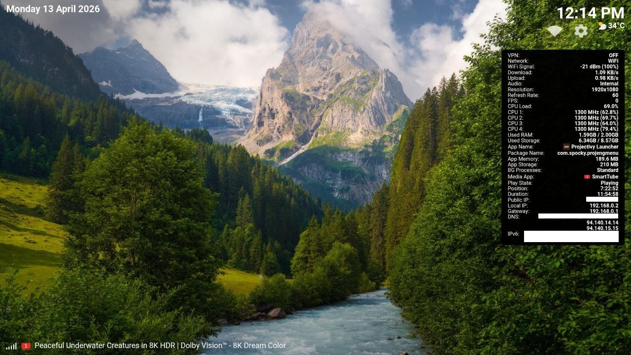
Available sys_* fields
sys_* fields are delivered automatically once per second. You do not declare them in config.json — just register callbacks in your JavaScript using onFieldChange.add().
Display & FPS
| Field | Description | Example value |
|---|---|---|
| sys_display_res | Screen resolution | "1920x1080" |
| sys_display_fps | Screen refresh rate (Hz) | "60" |
| sys_now_fps | Video playback FPS | "23.97" |
CPU
| Field | Description | Example value |
|---|---|---|
| sys_cpu_load | Total CPU usage percentage | "42%" |
| sys_cpu_temp | CPU temperature | "65°C" |
| sys_cpu_governor | Active CPU governor | "performance" |
| sys_cpu_clock_0 | Core 0 frequency | "1300 MHz (62.8%)" — also _1, _2… up to the number of cores |
Memory
| Field | Description | Example value |
|---|---|---|
| sys_ram_used | Used RAM (formatted) | "3.20GB" |
| sys_ram_total | Total RAM (formatted) | "8.00GB" |
| sys_ram_free | Free RAM (formatted) | "4.80GB" |
| sys_ram_used_kb | Used RAM in raw kilobytes | 3355648 (integer) |
| sys_ram_total_kb | Total RAM in raw kilobytes | 8388608 (integer) |
Storage
| Field | Description | Example value |
|---|---|---|
| sys_storage_used | Used internal storage (formatted) | "6.34GB" |
| sys_storage_total | Total internal storage (formatted) | "8.57GB" |
| sys_storage_free | Free internal storage (formatted) | "2.23GB" |
| sys_disk_used_bytes | Used internal storage in raw bytes | integer |
| sys_disk_total_bytes | Total internal storage in raw bytes | integer |
| sys_ext_storage_used | Used external storage (formatted) | formatted string |
| sys_ext_storage_total | Total external storage (formatted) | formatted string |
| sys_ext_storage_free | Free external storage (formatted) | formatted string |
| sys_ext_disk_used_bytes | Used external storage in raw bytes | integer |
| sys_ext_disk_total_bytes | Total external storage in raw bytes | integer |
Network & connectivity
| Field | Description | Example value |
|---|---|---|
| sys_net | Active connection type | "WiFi" / "Ethernet" / "Cellular" / "None" |
| sys_conn_dl | Download speed | "1.09 KB/s" |
| sys_conn_ul | Upload speed | "0.98 KB/s" |
| sys_vpn | VPN active (detected via IpInfoMonitor) | Boolean |
| sys_wifi_signal | WiFi RSSI in dBm | -21 — value -200 means not connected |
| sys_audio_route | Active audio output | "Bluetooth" / "HDMI" / "USB" / "Internal" / "Unknown" |
IP addresses
| Field | Description | Example value |
|---|---|---|
| sys_ip_public | External public IP (fetched every 30 min) | "203.0.113.5" |
| sys_ip_local | Local LAN IPv4 | "192.168.0.2" |
| sys_ip_gateway | Default gateway | "192.168.0.1" |
| sys_ip_dns | DNS servers, comma-separated | "94.140.14.14,94.140.15.15" |
| sys_ip_ipv6 | IPv6 addresses, comma-separated | string or "" |
| sys_ip_vpn | VPN tunnel IPv4 | string or "" |
| sys_ip_vpn_type | VPN interface type | "tun" / "wg" / "ppp" or "" |
| sys_ip_vpn_iface | VPN interface name | "tun0" or "" |
Now Playing (media)
| Field | Description | Example value |
|---|---|---|
| sys_now_title | Track / video title | string or "" |
| sys_now_artist | Artist name | string or "" |
| sys_now_playing | Playback state | 3 = playing, 2 = paused, other = stopped |
| sys_now_app | Display name of the media app | "SmartTube" |
| sys_now_app_icon | Media app icon as base64 PNG data URL | "data:image/png;base64,…" |
| sys_media_position | Current playback position | "7:22" |
| sys_media_duration | Total duration | "11:54" |
| sys_media_is_live | Whether the stream is live | Boolean |
Foreground app
| Field | Description | Example value |
|---|---|---|
| sys_app_name | Display name of the foreground app | "Projectivity Launcher" |
| sys_current_app | Package name of the foreground app | "com.spocky.projengmenu" |
| sys_app_icon | Foreground app icon as base64 PNG data URL | "data:image/png;base64,…" |
| sys_app_memory | App memory usage (formatted) | "189.6 MB" |
| sys_app_storage | App storage usage (formatted) | "210 MB" |
| sys_active_processes | Background process count (-1 = standard mode) | 4 or -1 |
Time, date & weather
| Field | Description | Example value |
|---|---|---|
| sys_time | Current time (respects user time pattern setting) | "12:14 PM" |
| sys_date | Current date (respects user date pattern setting) | "13/04/26" |
| sys_weather_temp | Weather temperature | "34°C" |
| sys_weather_icon | Weather condition — emoji (wttr.in) or icon URL (other sources) | "☀️" or URL string |
Complete standalone overlay example
A single index.html (no ZIP needed) that shows time, CPU, RAM and local IP using sys_* fields:
<!DOCTYPE html>
<html>
<head>
  <meta charset="UTF-8">
  <style>
    html, body {
      margin: 0; padding: 0;
      width: 100vw; height: 100vh;
      overflow: hidden;
      background: transparent;
      font-family: monospace;
    }
    #panel {
      position: absolute;
      top: 16px; right: 16px;
      background: rgba(0,0,0,0.75);
      border-radius: 10px;
      padding: 14px 18px;
      color: #fff;
      min-width: 200px;
    }
    .row {
      display: flex;
      justify-content: space-between;
      gap: 12px;
      margin-bottom: 6px;
      font-size: 13px;
    }
    .label { color: #888; }
    .value { color: #fff; font-weight: 600; }
  </style>
</head>
<body>
  <div id="panel">
    <div class="row">
      <span class="label">Time</span>
      <span class="value" id="time">--:--</span>
    </div>
    <div class="row">
      <span class="label">CPU</span>
      <span class="value" id="cpu">--%</span>
    </div>
    <div class="row">
      <span class="label">RAM</span>
      <span class="value" id="ram">-- GB</span>
    </div>
    <div class="row">
      <span class="label">IP</span>
      <span class="value" id="ip">---.---.---.---</span>
    </div>
  </div>

  <script>
    window.onFieldChange = window.onFieldChange || {};

    onFieldChange.add('sys_time',     function(v) { document.getElementById('time').textContent = v; });
    onFieldChange.add('sys_cpu_load', function(v) { document.getElementById('cpu').textContent  = v; });
    onFieldChange.add('sys_ram_used', function(v) { document.getElementById('ram').textContent  = v; });
    onFieldChange.add('sys_ip_local', function(v) { document.getElementById('ip').textContent   = v || 'N/A'; });
  </script>
</body>
</html>
Building a multi-widget ZIP with WidgetAnchor
The most powerful way to create widgets is inside a ZIP using the WidgetAnchor base class pattern, as used by the All-in-One Overlay Pack. This lets you build multiple independent widgets in a single overlay, each with its own position, opacity, margin, and visibility — all controllable from config.json.
How WidgetAnchor works
WidgetAnchor is a custom HTML element base class (defined in scripts/widget-anchor.js) that handles absolute positioning and visibility via CSS custom properties. Every widget that extends it automatically gets:
- Absolute positioning on the screen controlled by a class name (e.g.,
Top-Right) --visibleCSS variable (0 or 1) multiplied with--opfor opacity--mx/--myCSS variables for margin invw/vh
widget-anchor.js (include this in every multi-widget ZIP):
class WidgetAnchor extends HTMLElement {

  static cssInjected = false;

  constructor() {
    super();
    this._position = "Top-Right";
  }

  connectedCallback() {
    if (!WidgetAnchor.cssInjected) {
      const style = document.createElement("style");
      style.textContent = `
        .widget-anchor {
          display: inline-block;
          position: absolute;
          opacity: calc(var(--visible, 1) * var(--op, 1));
          pointer-events: none;
          margin-top:    calc(var(--my, 0) * 1vh);
          margin-bottom: calc(var(--my, 0) * 1vh);
          margin-left:   calc(var(--mx, 0) * 1vw);
          margin-right:  calc(var(--mx, 0) * 1vw);
        }
        .widget-anchor.Top-Left       { top: 0; left: 0; }
        .widget-anchor.Top-Center     { top: 0; left: 50%; transform: translateX(-50%); }
        .widget-anchor.Top-Right      { top: 0; right: 0; }
        .widget-anchor.Middle-Left    { top: 50%; left: 0; transform: translateY(-50%); }
        .widget-anchor.Middle-Center  { top: 50%; left: 50%; transform: translate(-50%, -50%); }
        .widget-anchor.Middle-Right   { top: 50%; right: 0; transform: translateY(-50%); }
        .widget-anchor.Bottom-Left    { bottom: 0; left: 0; }
        .widget-anchor.Bottom-Center  { bottom: 0; left: 50%; transform: translateX(-50%); }
        .widget-anchor.Bottom-Right   { bottom: 0; right: 0; }
      `;
      document.head.appendChild(style);
      WidgetAnchor.cssInjected = true;
    }
    this.classList.add("widget-anchor");
    this._applyPosition();
  }

  onFieldChange(id, value) {
    switch (id) {
      case "visible":  this.style.setProperty("--visible", value ? 1 : 0); return;
      case "position": this._position = value; this._applyPosition(); return;
      case "opacity":  this.style.setProperty("--op", value); return;
      case "marginX":  this.style.setProperty("--mx", value); return;
      case "marginY":  this.style.setProperty("--my", value); return;
    }
  }

  _applyPosition() {
    this.classList.remove(
      "Top-Left", "Top-Center", "Top-Right",
      "Middle-Left", "Middle-Center", "Middle-Right",
      "Bottom-Left", "Bottom-Center", "Bottom-Right"
    );
    this.classList.add(this._position);
  }
}
Available anchor positions
Top-Left, Top-Center, Top-Right, Middle-Left, Middle-Center, Middle-Right, Bottom-Left, Bottom-Center, Bottom-Right
Creating your own widget — step by step
Step 1 — Create scripts/my-widget.js extending WidgetAnchor:
class MyWidget extends WidgetAnchor {
  constructor() {
    super();
    this.attachShadow({ mode: "open" });
    this.shadowRoot.innerHTML = `
      <style>
        :host { display: block; pointer-events: none; }
        #txt  {
          color: var(--myColor, #fff);
          font-size: calc(var(--mySize, 2) * 1vw);
          font-weight: bold;
        }
      </style>
      <span id="txt">Hello</span>
    `;
    this._txt = this.shadowRoot.querySelector("#txt");
  }

  connectedCallback() {
    super.connectedCallback();
    const d = window.onFieldChange;

    // Wire config fields to WidgetAnchor base class
    d.add("myShow",    v => super.onFieldChange("visible",  v));
    d.add("myAnchor",  v => super.onFieldChange("position", v));
    d.add("myOpacity", v => super.onFieldChange("opacity",  v));
    d.add("myMarginX", v => super.onFieldChange("marginX",  v));
    d.add("myMarginY", v => super.onFieldChange("marginY",  v));

    // Wire config fields to CSS vars (most efficient for style-only changes)
    d.add("myColor",   v => this.style.setProperty("--myColor", v));
    d.add("mySize",    v => this.style.setProperty("--mySize",  v));

    // Wire a sys_* field to the DOM
    d.add("sys_time",  v => { this._txt.textContent = v ?? ""; });
  }
}
customElements.define("my-widget", MyWidget);
Style efficiency
When a field only affects a CSS property, using this.style.setProperty("--my-var", value) is more efficient than re-rendering the template. Reserve full re-renders for structural DOM changes.
Step 2 — index.html: load widget-anchor.js first, then your widget scripts, and place the custom element tag inside the overlay container:
<!DOCTYPE html>
<html lang="en">
<head>
  <meta charset="UTF-8">
  <style>
    html, body {
      margin: 0; padding: 0;
      width: 100vw; height: 100vh;
      overflow: hidden;
      background: transparent;
    }
    #overlay {
      position: absolute;
      inset: 0;
      pointer-events: none;
      z-index: 999999;
    }
  </style>
</head>
<body>
  <div id="overlay">
    <my-widget></my-widget>
  </div>

  <script src="scripts/widget-anchor.js"></script>
  <script src="scripts/my-widget.js"></script>
</body>
</html>
Step 3 — config.json: add a block for your widget with all its fields. The standard field set for a WidgetAnchor-based widget is:
{
  "title": "My Widget",
  "filename": "my-widget",
  "blocks": [
    {
      "title": "My Widget",
      "fields": [
        {
          "id": "myShow",
          "title": "Show",
          "type": "toggle",
          "default": true
        },
        {
          "id": "myAnchor",
          "title": "Position",
          "type": "select",
          "default": "Top-Right",
          "options": [
            "Top-Left", "Top-Center", "Top-Right",
            "Middle-Left", "Middle-Center", "Middle-Right",
            "Bottom-Left", "Bottom-Center", "Bottom-Right"
          ]
        },
        {
          "id": "myMarginX",
          "title": "Margin X (vw)",
          "type": "number",
          "default": 1,
          "min": 0,
          "max": 20,
          "step": 0.5
        },
        {
          "id": "myMarginY",
          "title": "Margin Y (vh)",
          "type": "number",
          "default": 1,
          "min": 0,
          "max": 20,
          "step": 0.5
        },
        {
          "id": "myOpacity",
          "title": "Opacity",
          "type": "number",
          "default": 1,
          "min": 0,
          "max": 1,
          "step": 0.05
        },
        {
          "id": "myColor",
          "title": "Text Color",
          "type": "color",
          "default": "#ffffff"
        },
        {
          "id": "mySize",
          "title": "Font Size (vw)",
          "type": "number",
          "default": 2,
          "min": 0.5,
          "max": 10,
          "step": 0.1
        }
      ]
    }
  ]
}
Step 4 — Zip the files (without a wrapping folder, or inside one single folder) and load it in tvQuickActions via Select ZIP file.
Community: If you need help or want to share widgets, join t.me/tvquickactions.